Control charts are a great tool for monitoring your processes over time. This way, you can easily see variation. You can use control charts to determine if your process is under statistical control, the level of variation native to your process, and the nature of the variation (common cause or special cause).
When Do You Use Control Charts?
Generally, a control chart is used in the control phase of a DMAIC project to help lock in your gains and automate an alarm system that lets you know if the process is failing. However, if a process has existing data, you could use the same tools and techniques to prove the level (or lack) of control in the current state system. And, of course, the findings from a control chart analysis could be a launching point for improvement initiatives.
A control chart is an extension of a run chart. The control chart includes everything a run chart does but adds upper control limits and lower control limits at a distance of 3 Standard Deviations away from the process mean. This shows the process capability and helps you monitor a process to see if it is within acceptable parameters or not.
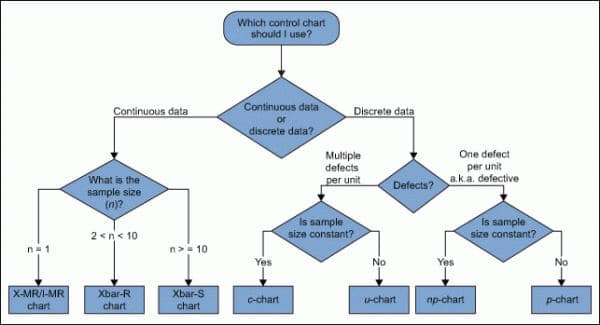
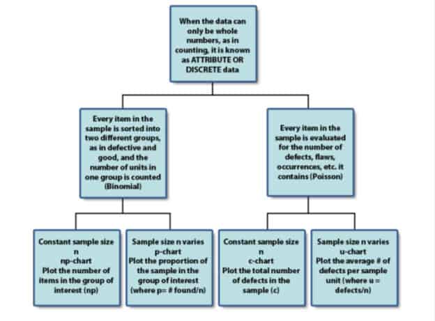
There are multiple kinds of control charts. You need to choose the right one based on the kinds of data sets you are mapping and other conditions. The kind of chart you use will affect the calculations of control limits you place in the chart.
Practical Thoughts Around Control Charts
A colleague once labeled the Upper & Lower control limits for a process he was responsible for as the “Time to update the resume lines” because if the process got out of control, he might be out of a job!
Use a control chart to tell the difference between common cause and special cause variation in a new process, or use it to determine how much common cause variation exists.
Control Chart Tips
- Specification lines should NEVER be part of a control chart.
- You should gather data for a control chart in the order of production.
- The ease of data collection is not a major concern.
- Collecting data related to a critical product or process parameter is more important.
- Never gather data from inspection records because it is too late–the cause for a point out of control, shift, or trend is lost because it happened hours earlier.
- Put at least six points in the range of a control chart to ensure adequate discrimination.
- We need six points (strata, units of measure) under the upper control limit of the range in order to have sufficient measurement discrimination. This is due to rounding. Too much rounding causes a loss of information about dispersion in a sample.
- A control chart can be used to identify the following causes
- Shifts
- Trends
- A point outside control limits
- NOT anything to do with specification limits.
What Kind of a Control Chart to Use?


Control Chart vs. a Run Chart
A run chart can reveal shifts and trends but not points out of control. It does not have control limits; therefore, it cannot detect out-of-control conditions. You can turn a run chart into a control chart by adding upper and lower control limits.
Control Limits
Control limits are the voice of the process (different from specification limits, which are the voice of the customer.) They show what the process is doing and act as a guide for what it should be doing. Control limits also show that a process event or measurement is likely to fall within that limit.
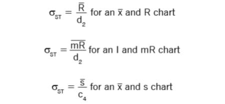
Control Limits are Calculated by:
- Estimating the standard deviation, σ, of the sample data
- Multiplying that number by three
- Adding (3 x σ to the average) for the UCL and subtracting (3 x σ from the average) for the LCL
Mathematically, the function of control limits looks like:

A Control Chart Indicates a Process is Out of Control When:
The following point to out-of-control conditions on a control chart:
- Six consecutive points, increasing or decreasing.
- Fourteen consecutive points alternating up and down.
- One or more points outside the control limits.
Control Charts: Usage & Terms
Trend: Seven points in a row in either an upward or downward direction.
Shift: Seven points in a row either above or below the center line
Extreme shift: Seven points in a row that are beyond the control limits, not a trend
Trend: Seven points in a row in either an upward or downward direction
Drift: A process is expected to drift, for no particular reason, about 1.5 standard deviations over the long run.
Control Chart Videos
How to Create Control Charts Using MiniTab
Other Notes About Control Charts
- Also, see Rational Sub Grouping.
ASQ Six Sigma Black Belt Control Chart Questions
Question: The purpose of using control charts is to
(A) Determine if the process is performing within specifications.
(B) Evaluate process performance over time.
(C) Determine how to recreate the process.
(D) Detect the causes of non-conformities.
Answer:
1: p charts are used to monitor discrete data. See the control chart matrix in on this page. Also, review attribute charts.
I & MR charts and X Bar charts are for continuous data and for when you have subgroups of size = 1. You use the ImR (XmR) chart only when logistical reasons prevent you from having larger subgroups or when there is no reasonable basis for rational subgroups.
Use X Bar R Control Charts when you have small amounts of constant, continuous data and when you can rationally collect measurements in subgroups of generally between two and 10 observations.
When you’re ready, there are a few ways I can help:
First, join 30,000+ other Six Sigma professionals by subscribing to my email newsletter. A short read every Monday to start your work week off correctly. Always free.
—
If you’re looking to pass your Six Sigma Green Belt or Black Belt exams, I’d recommend starting with my affordable study guide:
1)→ 🟢Pass Your Six Sigma Green Belt
2)→ ⚫Pass Your Six Sigma Black Belt
You’ve spent so much effort learning Lean Six Sigma. Why leave passing your certification exam up to chance? This comprehensive study guide offers 1,000+ exam-like questions for Green Belts (2,000+ for Black Belts) with full answer walkthroughs, access to instructors, detailed study material, and more.

Comments (23)
what should never be included on a control chart of any kind.
This discussion has been moved into the private members area. For a full walkthrough on how to answer this question, join today!
What pattern of control chart should be desirable to accept these process?
See the diagrams on the run chart page: https://sixsigmastudyguide.com/run-chart/
the ucl and lcl.
UCL = mean + 3*σ / n^(1/2)
Where did you get this formula? I could not find it anywhere in the Villanova SSBB information.
Amy, one of my misgivings about the Villanova program is that they test you on items not in their materials. They do list many books and outside references they want you to be familiar with. Their stance is that their exam is not a comprehensive test of their material, but rather an assessment of the industry’s material. I don’t recall which book, but I have a list of my references here.
Is this formula to calculate the UCL also applicable to the IASSC black belt exam?
I don’t see why it wouldn’t be, Dare-Idow.
Ted,
Given the definitions above, is a trend ALWAYS out of control?
Yes. That’s my understanding. In practical usage I would think that there should be some time-series dependency.
Hey I have a doubt. In the question B) the answer for UCL is calculated to be 41.71. However with Mean 35 and S.D of 5, the value of Mean+3Sigma = 50. Hence, if the samples follow a normal distribution, they will fall outside the control limit of 41.71.
In SPC the control limits are assigned such that the variation falls within the limits. I dont seem to understand the logic behind this calculation. Usually the formula used would be X-DoubleBar + A2Rbar
Hi Narayanan, We cover question breakdown and approach in the Guided option of my Pass Your Six Sigma Green Belt study guide course. There you can post questions and discuss solution sets with experts. Join up and add this to the discussion!
The control chart decision tree given above confuses sample size with subgroup size, please correct me if I am wrong.
I don’t think so, Parveen but I could be wrong. What specifically are your concerns?
Good afternoon Ted, great article!! I represent Thomas Pyzdek of the Pyzdek institute and would love to link up and discuss your article!
Hi Taylor,
Thanks for the warm comments! Email sent.
Best, Ted.
Dear Sir
I am very much impressed to learn such kind of lesson what you shared. Really its amazing !!!
With Regards
Nur Mohammed Munshi
Bangladesh
the upper control limit and lower control limit.
Doesn’t this question assume that we are doing XR based on the sample size? If so, isn’t the upper control limit formula for X chart:
X bar bar + A2 * Rbar
and the formula for R chart:
D1*Rbar
Why are we to use the following formula?
mean + 3*σ / n^(1/2) vs the ones above
Hello April-Lynn Larry,
Its D4*Rbar not D1*Rbar
Both the equations are valid, you can find detail explanation in our article
https://sixsigmastudyguide.com/x-bar-r-control-charts/
Thanks
thank you so much for this awesome web site me and my sept precious this content and penetration
You are very welcome, Marcos.