The normal probability plot is a graphical technique for normality testing: assessing whether or not a data set is approximately normally distributed. In other words, a normal probability plot is a graphical technique to identify substantive departures from normality. The normal probability plot is one type of quantile-quantile (Q-Q) plot.
A Normal Probability Plot compares the values in a data set (on the vertical axis) with their associated quantile values derived from a standardized normal distribution (on the horizontal axis). In other words, it plot graph Z-scores against the data.
Why Do You Use a Normal Probability Plot?
The normal probability plot is formed by plotting the sorted data with an approximation to the means or medians of the corresponding order statistics, and we do this because it helps us visualize the data. We use a normal probability plot in order to determine if a small set of data comes from a normal distribution. In other words, if we get a straight line from the plot, we can say the process is normally distributed. Thus, it is an excellent option to determine the Process capability.
When Do You Use a Normal Probability Plot
The data are drawn against a theoretical normal distribution in a manner that the points should form almost a straight line. Departures from this straight line indicate departures from normality. This includes identifying outliers, skewness, kurtosis, a need for transformations, and mixtures.

How to Construct a Normal Probability Plot
1. Firstly, arrange the values in ascending order. In other words, arrange the n number of values from minimum to maximum.
2. Secondly, arrange a rank order number(i) from 1 to n. Here n is the total number of samples
3. Thirdly, calculate the cumulative probability for each rank order from1 to n values
For example: f(i) = (i-0.375)/(n+0.25)
4. Then, for each cumulative probability value, determine the z-value from the standard normal distribution.
5. Next, create a scatter plot with the sorted data versus corresponding z-values
6. Finally, analyze the graph. If all the points are roughly on a straight line, then determine if it follows the normal distribution.
Example of Using the Normal Probability Plot in a Six Sigma Project
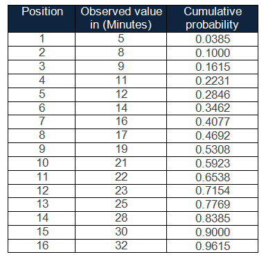
Example: The data in the table below is a random sample of 16 individuals’ wait times in the coffee shop. Is there evidence to support the belief that the variable of waiting time follows a normal distribution?
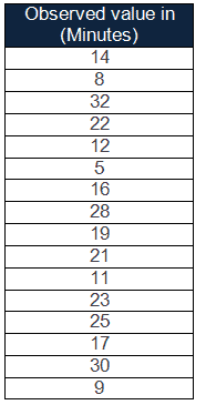
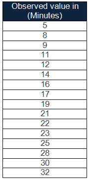
Step 1: Arrange data in ascending order
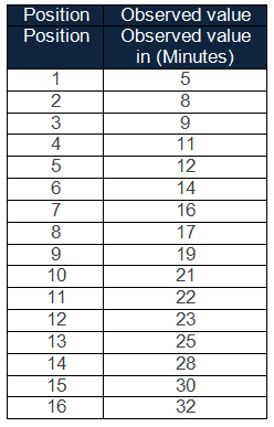
Step 2: Then, assign a rank order number(i) from 1 to n. For instance, the total number of samples n equals 16.
Step 3: Calculate the cumulative probability
f(i) = (i-0.375)/(n+0.25)
for i=1, f(1) =(1-0.375)/(16+0.25) = 0.0385
for i=2, f(2) = (2-0.375)/(16+0.25) = 0.1000, similarly calculate for other values.
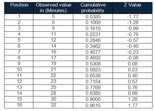
Step 4: Further, determine the z value for each cumulative probability
Step5: Then, create a scatter plot with the sorted data versus corresponding z-values
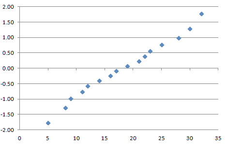
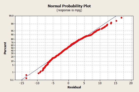
Step 6: Analyze the graph: To explain, from the above graph, it is almost clear that the Normal probability plot is close enough to linear. Hence we conclude that wait time follows a normal distribution.
Comments (9)
need the data set to understand the concept
Data set added!
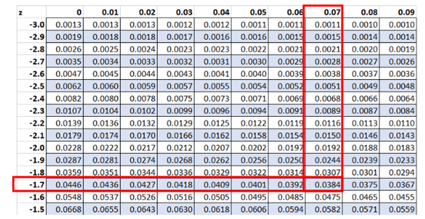
Can you please explain how to determine the Z value. Can you share any reference to determine the Z value as shown in the table on step 4.
Hi Manimaran,
Thank you for the comment. We have a graphic under step 4 that shows you how to look up the z value.
Do you see on the chart how the cumulative probability is 0.0384?
If you look for that value in the z chart (on our diagram that’s where the 2 red rectangles instersect), you’ll see a value of 0.0385. That’s close enough for our purposes.
You then trace out to the 2 axis to get the actual value. Again, following each of the red rectangles in the picture you get -1.77.
You repeat this process for every value in the chart.
Does that make sense?
Best, Ted.
How do I estimate process capability from a normal probability plot?
Very interesting question. Think about the mathematical properties you could observe in a normal probability plot. Then think about what the inputs are to a process capability question. What commonalities do you see?
What is the basis of f(i) = (i-0.375)/(n+0.25)
Please I don’t understand how to find the z-value
No problem, Abraham.
Try my tutorial here: Z Values.
If you have any issues, just leave your specific questions in the comments on that page and I’ll do my best to help out.
Best, Ted.