An XmR chart (aka Shewhart’s Control Chart) calculates the control limits from the moving average range. XmR chart, also called an I-MR chart, is a combination of two charts (Individual and Moving Range) to track the process variability based on the samples taken from a process over a period of time. In the XmR chart, each data point consists of one observation of continuous data.
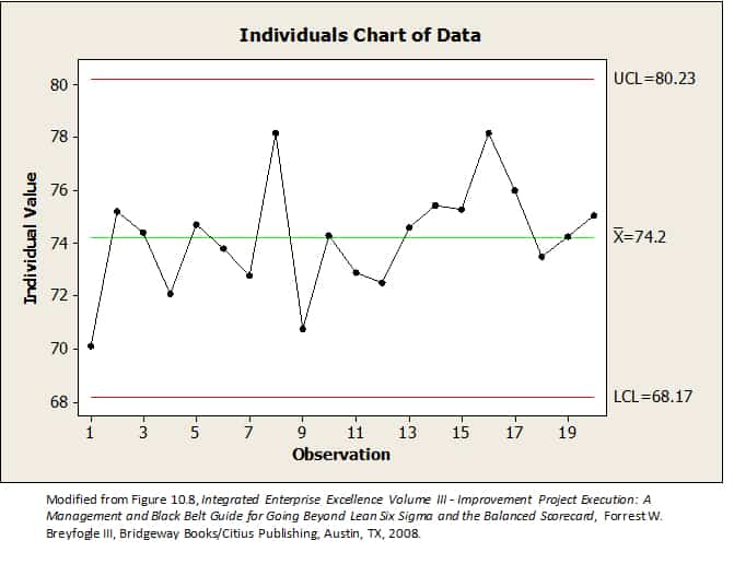
The XmR chart consists of the X chart at the top and the MR (moving range) chart at the bottom. The X chart is a plot of the time-ordered data. For example, the X chart could represent a plot of a single patient’s sequential daily blood pressure readings. The line of central tendency on the X chart is the mean, and the upper and lower control limits are three sigma deviations from the mean.
The moving range chart includes an upper control limit and a lower control limit. Points above the control limit indicate that there is a statistically significant greater variation at that time than expected by chance.
Why XmR Control Chart
The moving range chart is helpful for two reasons. First, it provides an estimate of precision. The R bar represents the average amount of variation in the data. The moving range chart is created from the absolute value of the difference between successive data points on the X chart. For example, the first point on the moving range chart is the absolute value of the difference between the first and second points on the X chart. Similarly, the second data point on the moving range chart is the absolute value of the difference between the second and third points on the X chart.
When to Use XmR Control Charts:
- When you have continuous data.
- When you have subgroups of size = 1.
- The XmR chart is beneficial when you can only gather individual data points, such as measuring the temperature of each piece in a production line.
- XmR charts can be useful for inherently variable monitoring processes, such as chemical reactions or biological processes.
How is an XmR chart different than the X̅-R chart?
An Individual chart displays the individual data points and monitors shifts in the process, whereas X̅ monitors mean change over time.
A Moving Range chart monitors the absolute difference between each measurement and its previous measurement. The Range Chart monitors the subgroup’s range change over time.
When would you use one over the other?
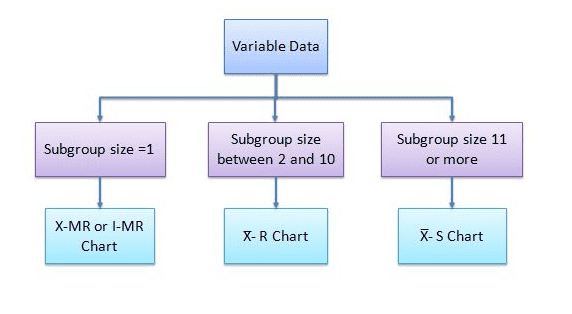
X̅ – R chart is to be used when large data is readily available, whereas an XmR chart is to be used in case of limited data. XmR chart is to be used when the subgroup size is one, while the X̅ – R chart is to be considered when the subgroup size is between two & ten, and the X̅ -S chart is used if the subgroup size is eleven or more.
XmR R Control Chart Definitions
An XmR chart is basically two separate charts–the Individuals (X) chart and the Moving Range (mR) chart. The combination of the two charts provides a complete picture of process behavior.
X Chart: The individual chart displays individual data points and monitors the mean and shifts in the process when collecting data points at regular intervals. This chart will help to identify the common and assignable causes in the process, if any.
mR Chart: While the Individual chart monitors the process mean, the Moving Range chart monitors the process variation when the data points are collected at regular intervals of time. In other words, the moving range chart tracks the absolute difference between each and its previous measurements.
How to Create & Use XmR Control Charts
Calculate the control limits for the X chart and MR chart using the averages from the X chart (X bar) and moving range chart (R bar). These calculations generate the control limits for the XmR chart.
- List all of your measurements for your XmR control chart.
- Calculate the moving range by using the absolute difference between each measure and subtracting one from the other sequentially.
- Finally, construct the control charts for the Individual and Moving range.
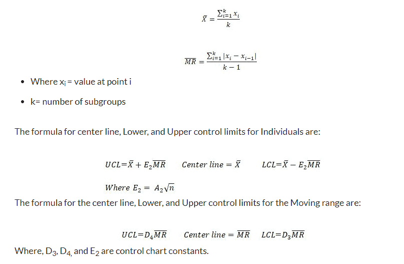
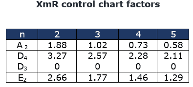
E2 being the constant for I-MR Chart: http://web.mit.edu/2.810/www/files/readings/ControlChartConstantsAndFormulae.pdf
For example, if you have measures of 4, 6, 3, and 5, you will then get the following differences:
- (4-6) = 2
- 6-3 = 3
- (3-5) = 2
- Calculate the mean of the samples.
- Calculate the mean of the individual moving ranges. This will act as the control limit – plot this horizontally on the graph.
- 2 + 3+ 2 = 7. 7/3 = 2.333
- Calculate the Upper and Lower Control Limits for the XmR control chart.
- Plot upper control limits (UCL) and lower control limits (LCL)
Example of an XmR Chart
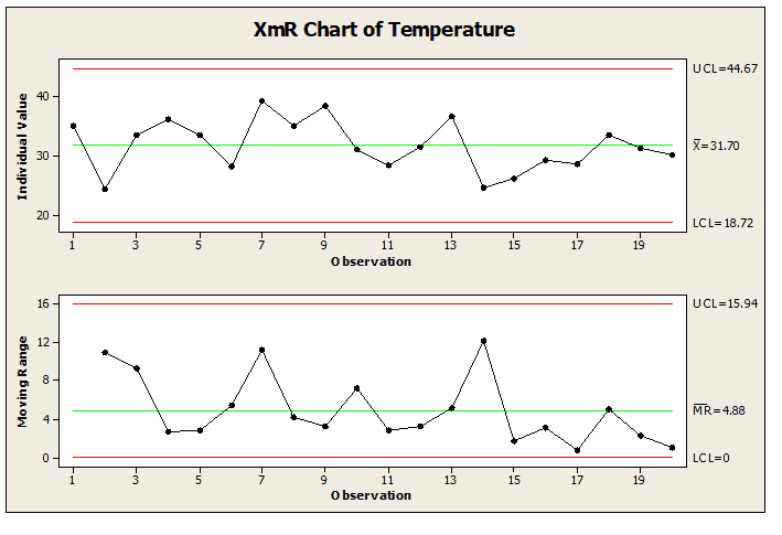
The following table shows the temperatures of 20 individual steel fasteners. Calculate the control limits for an XmR chart.
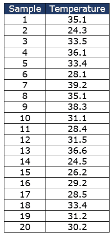
Now, Calculate the Moving Range
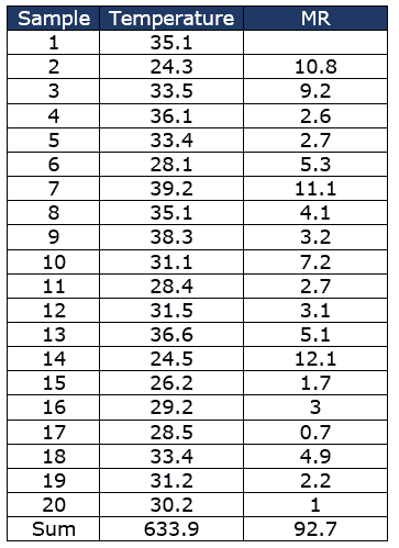
Calculate the X̅ and M̅R̅
- k=20
- X̅ = 633.9/20= 31.7
- M̅R̅ =92.7/19 =4.9
- n=2
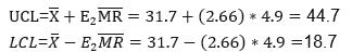
Calculate the Control limits for the Individual Chart
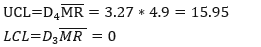
The Control limits for the Moving Average Chart:
Important notes
- Remember to NEVER put specifications on any kind of control chart, including the XmR chart.
- Use an X-Bar S chart when the subgroup size is > 10.
- Use an X-Bar R chart when the subgroup size is between 2 & 10.
- Use an XmR chart when the sample size is one and there is a lot of data.
Example of Using an XmR Chart in a DMAIC Project
Use XmR control charts for subgroup sizes equal to 1. For instance, utilize them for monthly reporting data such as customer complaints, inventory, and monthly sales data. Usually, for any process, assignable causes will be taken care of during the Analyze and Improve phases of DMAIC using different types of statistical tools like Regression, Design of Experiments, etc.
Variation of the process due to common causes can still exists while the process is under control. An XmR control chart helps to identify process abnormality due to assignable causes promptly, typically in the Control Phase of DMAIC. These charts will only signal that there is a problem in the process.
Let’s say that the Project chartered to run a DMAIC process with the stated goal of increasing customer satisfaction via Net Promoter Scores. Throughout the Measure Phase, we measured customer complaints to establish a baseline. Utilize an XmR Chart to illustrate trends in customer complaints.
Later, the Analyze Phase could have identified ways to eliminate several causes of variation. In the Improve phase, the team could have made changes to the process and piloted them. Utilize an XmR chart to observe the effects of the pilot. Additionally, in the Control Phase, incorporate continual monitoring of the XmR Chart into your control plan.
The Six Sigma team has to identify the cause of the problem and appropriate corrective action to be initiated. This is an iterative procedure for continuous improvement of the process.
Comments (8)
Good Morning Sir/Madam,
First of all, thanks for the important & useful information provided here by you, with detailed explanations.
I have a query that, here in “X-mR Chart” information page, you mentioned “X Bar R” chart word throughout the page. I think, there may be some typographical mistake, i.e. ‘X Bar R’ instead of ‘X-mR’.
Please confirm and clarify my doubts, and do the required changes.
Thanking you in anticipation.
Thanks & Regards,
Prasad V. Dhawle
Absolutely correct, Prasad. I’ve updated. Thanks for pointing it out!
I want to underline a small remark:
In the case of an XmR chart the value 2.66 is obtained by dividing 3 by the sample size-specific d2 anti-biasing constant for n=2, as given in most textbooks on statistical process control.
what i mean it is useless to keep d2 as a variable. because in any event is always n = 2 what gives us d2 = 1.128
I insisted on this point because often we pose this confusion: as long as we have individual data why n = 2
Thank you the article is very clear.
what is the d2 value for XMR Chart ? there is no d2 value for 1 sample size
When showing chart, should I be adding a line over
X and wavy one over R?
Hi.. I have a question about XnR charts and SPC in general. It is my understanding that this was designed for manufacturing but can these be leveraged to monitor human-driven workflows (e.g. HR Procurement) vs manufacturing industry?
I have been trying to find articles on this but thus far no luck. Yet, it feels like it should work especially since in the case of HR procurement workflows data we are dealing with we have the entire population of the data.
Any thoughts anyone?
Why the MR value should not devide by 4 ?
You are dividing by 3 because , the numerator is sum of the 3 values (2 + 3+ 2 ) . For Sample Mean , you are dividing by 4 because , the numerator is a sum of 4 values ( 4 + 6+ 3 + 5) .Hope this clarifies.
**Posting this because it may be useful for somehow who gets similar query**